Senior Capstone & Exhibition Project: Screens & Time
2018-2019 | Interaction Design
Since the majority of what I do is at the intersection of design and technology, I decided to focus on reducing screen time for my senior capstone project.
A detailed view of my capstone project can be found on it's own site: http://wkuglen.design.
The images below are from the exhibition the following spring.

Capstone
My senior capstone project focused on reducing screen time. As I would later describe in my exhibition:
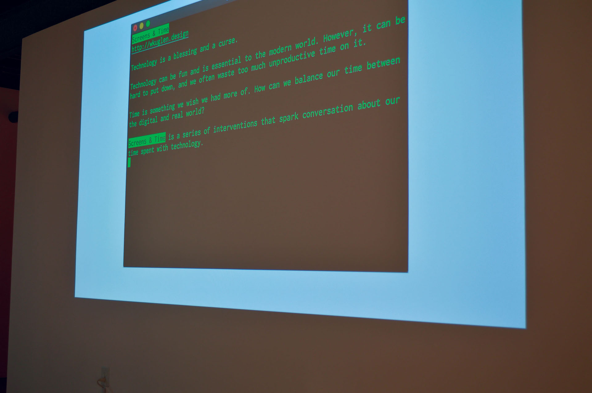
“Technology is a blessing and a curse.
Technology can be fun and is essential to the modern world. However, it can be hard to put down, and we often waste too much unproductive time on it.
Time is something we wish we had more of. How can we balance our time between the digital and real world?
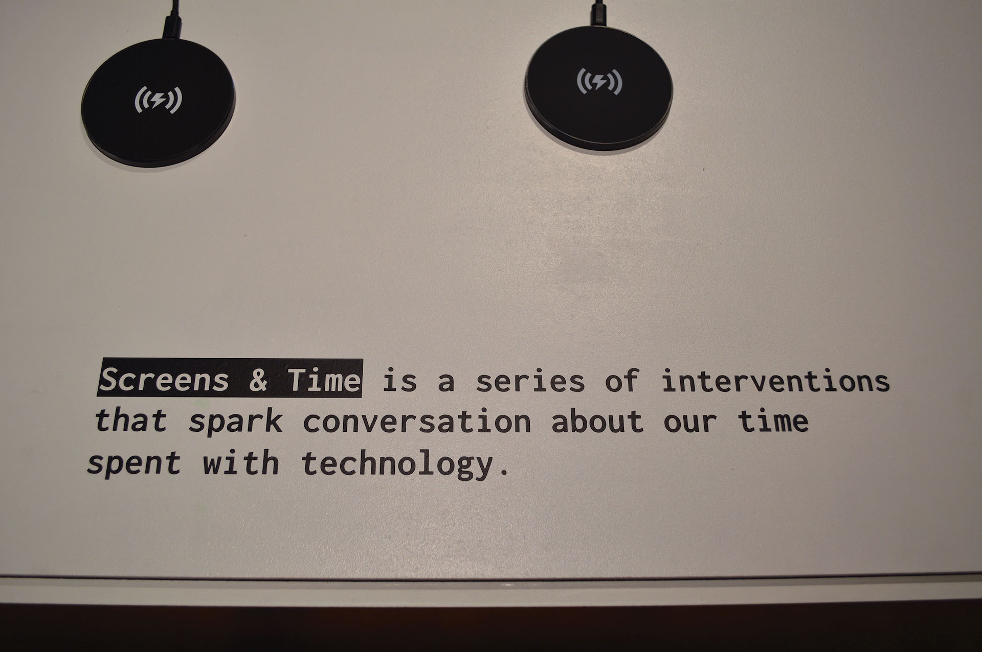
Screens & Time is a series of interventions that spark conversation about our time spent with technology.”
The purpose of my capstone project was to restrict the intrusiveness of personal computing devices through a series of interventions and experiments that limit the time spent on these devices.
I developed these interventions in three phases: Low-Fidelity, Mid-Fidelity, and High-Fidelity prototypes. I created 30 Low-Fidelity prototypes. From those, I chose 4 ideas to take a step further as Mid-Fidelity prototypes. And of those 4 prototypes, I took one idea to and turned it into a High-Fidelity prototype.
Exhibition
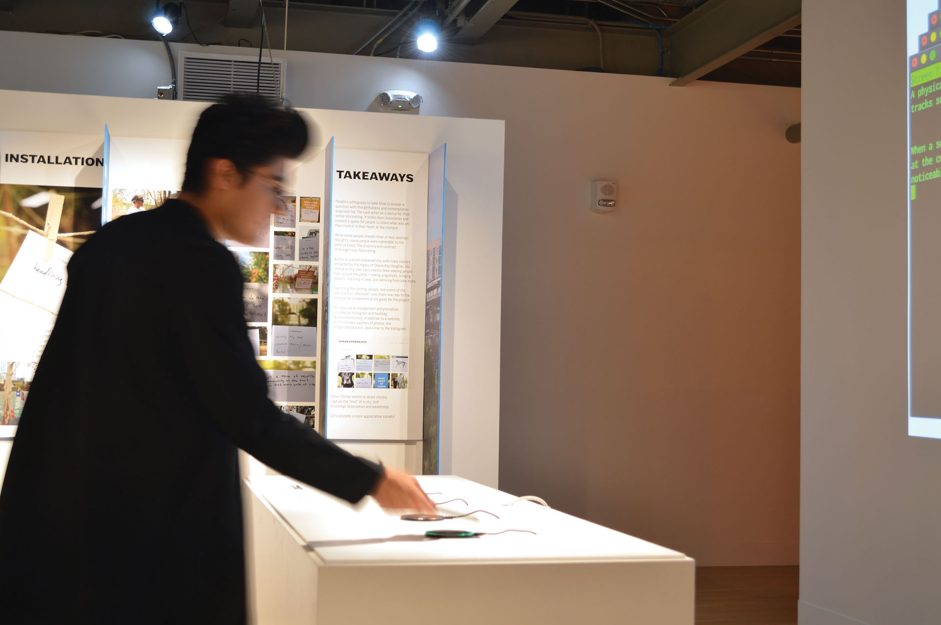
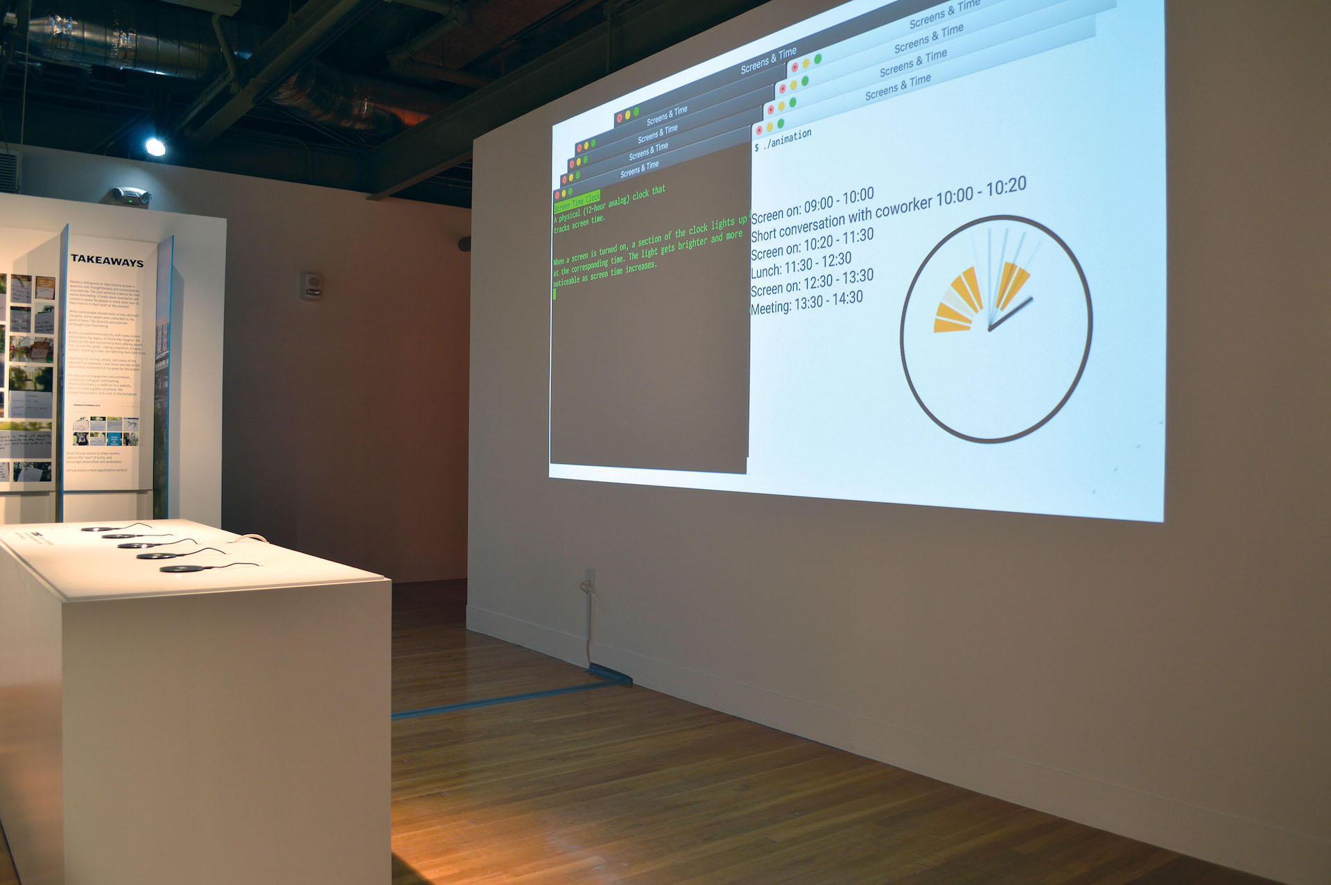
In the Spring of 2019, I exhibited my capstone project in the BFA Senior Exhibition Future Tense. My exhibition space was comprised of two major components: a projected video and an interactive table.
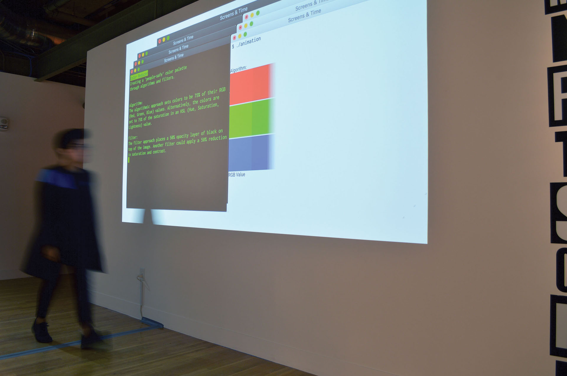
The video provided a brief overview of my project and then went into more detail on the 4 Mid-Fidelity prototypes from my capstone project. Each prototype had a description and a brief animation to illustrate the concept.
I chose to project a video because I wanted my exhibition to be ephemeral and outlive the time it was installed.
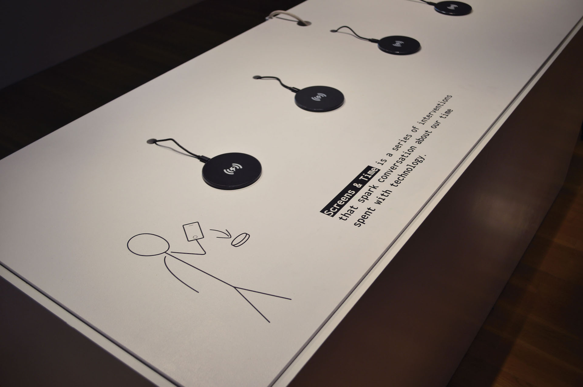
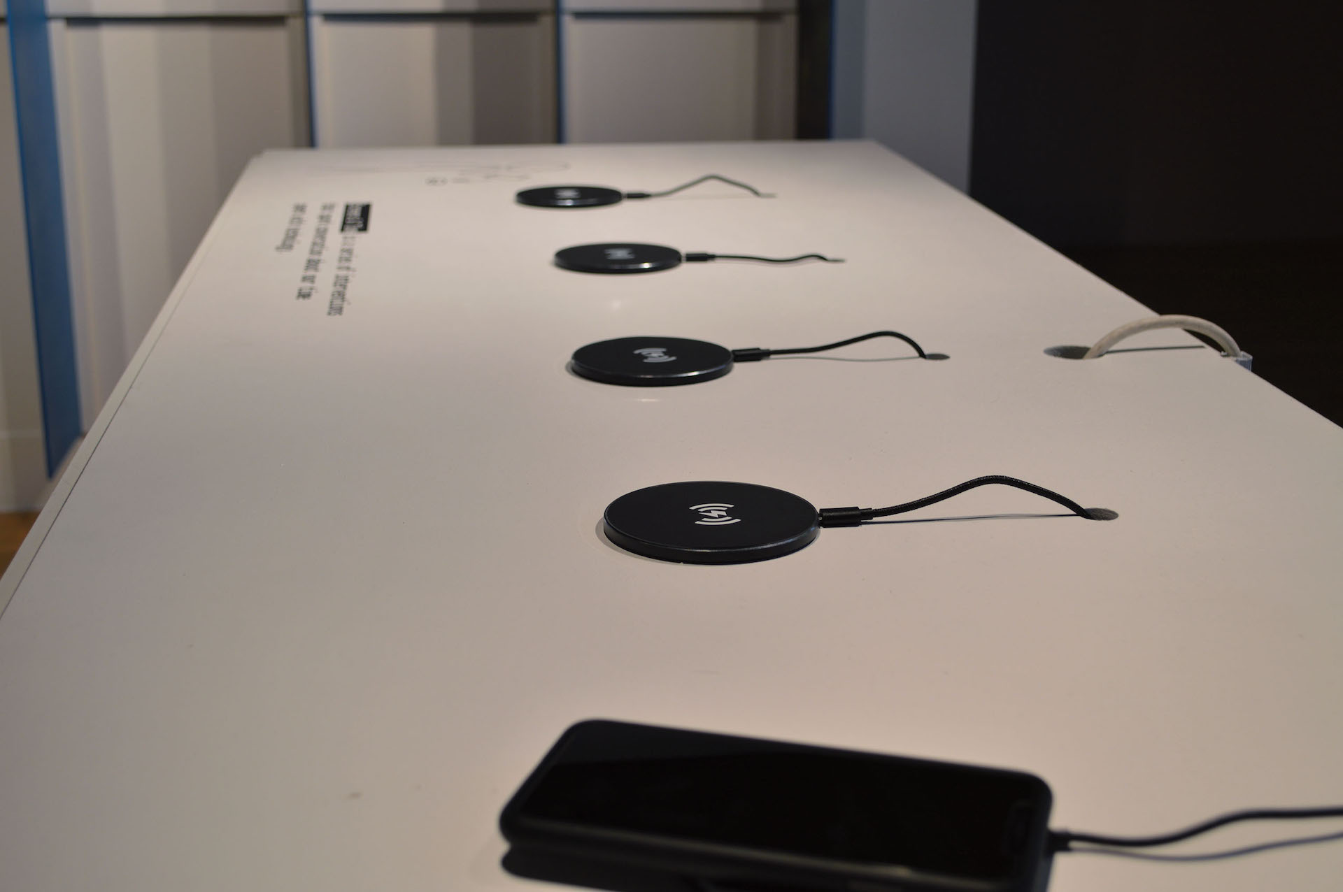
The table gave a one-sentence introduction to my project and encouraged viewers to interact with the project by placing their cell phone onto one of the wireless chargers.
Since my project was about reducing screen time, I wanted viewers to put their phone down while viewing my project.
I also challenged myself to make that interaction clear without using words, which led to the creation of the character on the table.
